Scribus: Leading, Kerning, and Tracking Text
_1bae2.png?itok=WN-tE5VU)
In "Tweaking Text in Scribus," I briefly described the tools available for manipulating text in Scribus. Now, it's time to really get your typographic geek on, and look in greater detail at how to adjust the spacing of text in Scribus: how to adjust the space between lines of text (leading), between characters (kerning), and upon a line (tracking).
In a word processor, adjustments of leading, kerning, and tracking are handled automatically. Generally, the results are good enough for most people and most purposes. However, the whole point of using a layout application like Scribus is to get things exactly to your likely. That means, at least some of the time, taking full control of the layout and making adjustments line by line, or even character by character.
The tools you need for each of these tasks are available by right-clicking a text frame and selecting from the context menu Properties -> Text. There, you will find a series of fields for adjusting different aspects of the text in the frame.
Leading
Leading is so-called because, in the days of hand presses, printers once used pieces of lead to separate lines of text (in fact, I am told, they often used anything at hand, including folded wedges of paper).
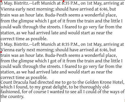
Digital fonts include a suggested leading. For a 1-12 point font, this is usually 2-3 points larger than the font size. A 12 point font, for example, usually has a leading of 14 points. These defaults are intended to make the font readable, but in some cases, decreasing or increasing the leading may improve readability, especially if the font in smaller than 10 points. Should the leading be the same size as the font, then the text is said to be "set solid."

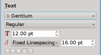
To set the leading in Scribus, go the linespacing field, which is fourth from the top of the Text tab. Set the field to Fixed Linespacing, and use the field to the right to set the leading by points. You will work most efficiently by increasing or decreasing the line spacing one point at a time, and pausing to evaluate the result before trying again.

Kerning
Just as fonts include suggested leadings, they also include suggested kerning. This suggestion is generally adequate, but some letter combinations throw off the character spacing unless you are using a monospaced font.
The combination "Va," for example, leaves a gaping hole between the two characters. Other combinations that may be less than ideal include ff, fi, and fl.

Some fonts include special characters called ligatures, which are combinations of problem-causing letters designed as a single character. If ligatures aren't used automatically with the font (it varies), you can add these characters from the Insert -> Ligature sub-menu (don't forget to delete the characters, if any, that they replace).
However, ligatures sometimes give an old-fashioned look to the text, and need to be inserted manually. In general, you will save time by going to Properties -> Text -> Advanced Settings -> Manual Spacing. Manual spacing is simply Scribus' name for kerning.
Tracking
When you have a single column of text, whether you need to adjust the tracking often depends on the alignment. Left-aligned or ragged right text is usually left the way it is, althought possibly you might want to adjust a few lines. The same is true of right and center aligned text, although they are rarely used.

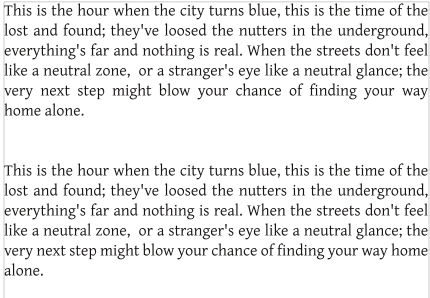
Usually, tracking only becomes important when text is Justified, with even margins on both the right and the left (Scribus also has a Forced Justified setting, but the main difference from merely Justified is that Force Justified will justify the last line of a paragraph, regardless of whether the number of characters are too few to fill the line). You can set alignment from Properties -> Text using the five small icons below the linespacing field you use to adjust leading.
Tracking can also improve the layout of text if you are using multiple columns, or the font size is too large for the line length. In all situation where there are numerous hyphens, and/or large variations in spacing between words and characters, you can adjust the tracking to improve the layout.
To adjust tracking, select the text whose spacing you want to fix. Usually, choosing an entire line works best, although your changes may cause part of your selection to move to another line. Then go to the Advanced Settings tab in the Properties window. Although you use manual tracking, just as you did with kerning, to adjust spaces between characters, the Min. and Norm fields for word tracking is usually easiest to work with -- if only because manual tracking quickly adds up to a large change across an entire line.
A good way to start with the word tracking fields is to set both Min. and Norm to the same setting -- often 100% -- and only adjust the Min. to allow for some variation if you are having trouble producing an evenly spaced line. Usuallly, adding a percentage lower than 100% is what you want to do, because problems with spacing tend to be too much rather than too little spacing between words. Otherwise, as with other alterations to spacing, tracking is mostly a matter of trial and error.
Making the changes
The advantage of the tools in the Properties window is that they let you work with as large a body of text as you want. If you want to work with the entire text frame, you only need to start making adjustments with the Text tools. Alternatively, you can select as little as a couple of characters to adjust.
If these tools are not enough, you might supplement them by inserting different size spaces from the Insert -> Space sub-menu. If you are unfamiliar with typography, some of the names of these different spaces may not be familiar to you; for example, an en space is the width of a lower case "n" and an em space the width of a lower case "m." Other spaces are relative to each other, and will be different from font to font. All these spaces are precise, but, since each requires a manual insertion, it is slower than the tools in the Properties window. Whether you fine these spaces useful depends on how much precision you need.
Improving leading, kerning, and tracking is a labor of perfection. However, as you work remember that the Undo button is always your friend. However, an even greater help is to make only slight changes one at a time. When you work with text, you are working at very small sizes, and a very little adjustment is all you need to make a change too large to be useful. Go slowly, and you will save time in the long run.


