Tweaking text in Scribus

In word processors, users generally settle for an appearance that is good enough. By contrast, in a design application like Scribus, you have the tools to adjust the layout until it is exactly the way you want.
That is especially true for text. Scribus not only provides tools for general management of the available fonts, but also for micro-managing everything from the size and shape of fonts to the spaces between characters and words and how a word is hyphenated at the end of a line.
Choosing Fonts
Generally, Scribus uses the installed system fonts, defaulting to the first in alphabetical order unless you change the default in File -> Preferences -> Tools. However, if you are a font collector, you may have thousands of fonts that you only want to access within Scribus. To make fonts available only to Scribus, close all documents (so that only the gray background of the Scribus window shows) and go to File -> Preferences -> Fonts -> Additional Paths to add the directories for additional fonts. If your files are hierarchially arranged, you only need to choose the top level directory to include all the fonts in sub-directories.
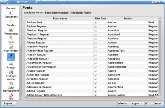
Sometimes, too, you may need to make a font unavailable because Scribus or your system can't display it. This is particularly a problem when the first font in alphabetical order is undisplayable, which can make you think something is wrong with Scribus in general. In such cases, you can stop the font from displaying in Scribus at File -> Preferences -> Fonts -> Available Fonts, and unchecking it in the Use Font column.
If you need to use an undisplayable font, or a font you don't have, you can set up a font substitution at File -> Preferences -> Fonts -> Font Substitution. For best results with a substitution, use a substitute whose letters take up the same space as the original font -- for example, Liberation Serif is designed as a substitution for Times Roman, and Liberation Sans for Helvetica and Arial.
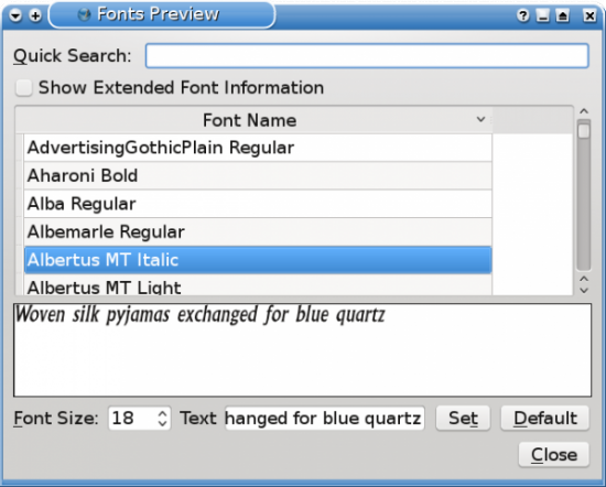
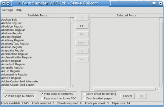
When choosing fonts within a document, most of the time the brief sample and summary available in Extras -> Font Preview may be enough. However, when you want to compare possible font choices, Scripts -> Font Sample is more useful. Font Sample creates a specimen document, showing all the fonts you select at different weights, so that you can easily compare them and choose the weight most suitable for your needs.
The selection of fonts is made unnecessarily difficult in Scribus by the fact that the Story Editor displays only a single font (although it does show some font effects, such as strike-throughs). However, if you position the Story Editor so that the main Scribus window is open, you can see how font choices effect your document.
Fine-Tuning Characters
Most of the time, you can use fonts as they come. However, for those who want to micro-manage, Scribus includes all the tools you need -- although, characteristically, they are not grouped together.
In the main window, the Insert menu contains tools for characters that, with most keyboard locales -- certainly the most common US ones -- you cannot easily enter from the keyboards. When the cursor is in a text frame, you can select characters such as the copyright sign and em and en (long and short) dashes, or various kinds of quotation marks. You can also replace poorly spaced letter combinations, such as "ff" with ligatures, or specially designed characters of multiple letters. Should none of the characters you need be available from the top level of the menu, you can select Insert -> Glyphs to see a complete set of characters for the current font.
By right-clicking in a text frame and selecting Properties -> Text -> Advanced Settings, you can adjust the vertical and horizontal of individual characters or words. However, adjustments using these tools should be made incrementally, with frequent checking of the result, since it is easy to destroy the look of a font once you start adjusting these characteristics.
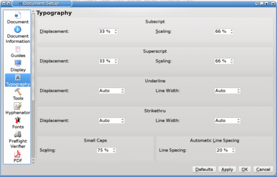
For editing font effects, the controls are in File -> Document Setup -> Typography. Here, you can adust such settings as the distance of superscript above the base line, or the size of subscript characters compared to other characters. The same provisions are also available for small caps, the elegant choice for all cap displays -- although, as with most layout applications, you are better off using the small cap typeface for a font if it is available rather than the small caps created by Scribus. All these settings can also be adjusted in File -> Preferences if you want to change them for all documents.
Perfecting Hyphenation and Spacing
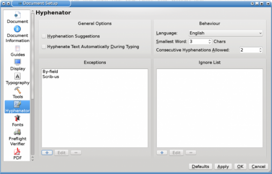
Word processors often hyphenate as you work. You set Scribus to hyphenate in this way from File -> Document Setup -> Hyphenator, but, in general, you are better off hyphenating a text frame as a final touch to the layout, when both the contents and the size and shape of the frame do not need to be adjusted. When you are ready, select the text frame followed by Effects -> Hyphenate Text to hyphenate the document.
If the results are not what you prefer, try editing the basic controls in File -> Document Setup -> Hyphenator. From this dialog, you can set the smallest number of characters in a hyphenated word, as well as the number of consecutive lines that end in a hyphen (more than 2 are usually considered inelegant). Just as importantly, you specify exactly how certain words are hyphenated (exceptions) or whether they are hyphenated at all (ignore). You can then choose Effects ->Dehyphenate Text, followed by Hyphenate Text to see if the layout is improved.
If all else fails, you can manually improve the appearance of the hyphenated text. Especially with justified text or or text in narrow columns, you might want to experiment not only with text size and alignment, but also tracking individual words and inserting thin spaces or non-breaking spaces to further enhance the appearance on a line to line basis.
What's it worth to you?
Needless to say, all these manipulations of text can be tedious and slow. But whether such efforts are worth doing depends on the document. For an office memo, you are undoubtedly better off with a word processor, that makes decisions for you, based on what the developers believe that most users want. After all, there are very few times -- if any -- that you want a memo to be a polished thing of beauty. Beyond a very basic level, a memo's contents are more important than its appearance.
But Scribus isn't designed for memo writing. It is meant to be used when a document's appearance does matter, either for branding or for a document like a book that is relatively permanent and, perhaps, long enough that a good design is useful for legibility.
Even in such cases, you may not want to use all Scribus' available tools. But, when you do, knowing that they're there can be reassuring.


