KOffice 2.0
More than a year after KDE 4.0 unveiled a radically revised desktop, KOffice 2.0 is preparing to release an equally revised office suite, which should be released before this article is published (KOffice 2.0-RC-1 was released in April 2009).
What users will see is not an extensive new feature set, but only a few additions here and there. Instead, just as KDE 4.0 provided the foundation for future developments on the desktop, KOffice promises to provide a solid basis for future improvements. Reflecting changes in the toolkit and library, the newest version of KOffice delivers a common interface across applications, enhanced graphical capacities and new accessibility to existing tools—all wrapped up in a look and feel proving that eye candy can be as much about usability and functionality as about superficial aesthetics. These changes are especially visible in major applications like KWord, KSpread, KPresenter, and Krita and Karbon14 (the main graphics programs), although they are evident in other KOffice applications as well.
This emphasis means that those who were hoping KOffice 2.0 would finally allow the office suite to match the rival OpenOffice.org feature for feature are going to be disappointed. If the late beta I am working from is a guide, KPresenter still will not have the ability to use sound or video, and KSpread will continue to lack filters and pivot tables. In fact, some features of KOffice 1.6.3, the previous official release, such as comments and expressions (autotext) in KWord or tables in KPresenter, may not find their way into KOffice 2.0 either. When you do find new features, they are apt to be fundamental ones, such as more printing options for KSpread.
However, this focus does not mean KOffice is lacking in scope. By any standard, KOffice 2.0 is an ambitious undertaking. With 11 applications to OpenOffice.org's six, and a considerably worse ratio of programmers, any release of KOffice is an exercise in logistics second only to a new version of KDE itself—and version 2.0 is more challenging than most releases. The new release not only marks KOffice's transition to the Qt 4.x toolkit, like most KDE-related software, but also new ports to OS X and Windows.
If that were not enough, version 2.0 also marks the first use of two major libraries: Flake, which introduces a new concept of shapes, together with tools to manage them; and Pigment, a color management library. No wonder, then, that the release is happening 16 months after the KDE 4.0 release and has staggered through ten alpha and seven beta releases. But, when KOffice 2.0 finally reaches release, the result promises to be a revamping that will allow the project developers to add smaller enhancements in point releases.
Like the KDE 3.0 series, KOffice 1.6.3 is functional but easy to underestimate, because it looks like a refugee from the late 1990s. By contrast, KOffice 2.0 looks as though it is designed to ensure that nobody ever will dismiss it solely on the basis of appearance.
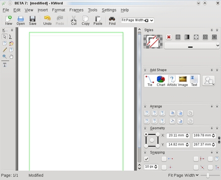
Ever since Microsoft Office 2007 replaced menus and toolbars with ribbons, rival office suites have been faced with the dilemma of either copying and looking modern or retaining the functionality of traditional program design and looking out of date. OpenOffice.org 3.0 met the challenge with a compromise that kept the traditional structure but increased the number of floating palettes or windows—selections of tools that could be positioned anywhere on the desktop or docked in the toolbar or against one side of the editing window. In version 2.0, KOffice's developers have opted for a similar solution, calling them dockers and adding controls for turning each one on or off in the Settings menu.
Dockers are accompanied by two panes to either side of the editing window. On the left is a pane with icons specific to the application. On the right is the pane containing multiple dockers. Click on an icon in the application pane, and the available dockers on the right change. The application pane, the docker pane or any individual docker can be removed from its position to float freely by dragging its title bar with the mouse. You also can drag dockers into different positions on the right-hand pane.
Alternatively, you can close panes, toolbars or dockers, or change the horizontal space given to the docker pane. Unless you are working with a maximized window on a wide-screen monitor, sooner or later, you probably will want to use these customizations to give yourself room to work.
Possibly too, you might want to reduce the number of dockers, especially when you are first learning KOffice 2.0. Otherwise, the effect is like sitting down in the cockpit of a commercial airliner and trying not to be overwhelmed by the dozens of controls available.
The success of this interface varies with the application and your use of it. The layout works best in feature-rich programs, such as Krita and Karbon14, where they increase the accessibility of tools (although at first you might find yourself peering anxiously as you wait for the mouse-over text to tell you what each icon does). In fact, both these graphics programs actually have had a very similar arrangement in earlier releases, which may be where the design originated. But in KSpread, it might seem like worthless clutter, because many of the dockers have to do with graphics or layout, neither of which many spreadsheets need. Similarly, if your word processing never extends beyond a memo, you might find that the default docker pane is overkill. The same is true in KPresenter if you don't do original diagrams.
Still, despite their initially formidable appearance, these panes and dockers do have the advantage of removing many tools from their hiding places in the menu and placing them where users can become curious and investigate them. You may find yourself learning more about KOffice applications than ever before, simply because you can see more of the possibilities.
Just as the Drawing toolbar added increased graphic capacity to the major OpenOffice.org applications, so dockers give KOffice applications more ability to handle pictures and primitives.
Some of this enhanced capacity is new, such as the calligraphy tool that resembles Inkscape's, or the availability of artistic text—graphical text that can follow angled or curving baselines. Similarly, the addition of ties or connectors gives KPresenter a large boost by adding the ability to create and manipulate organizational charts.
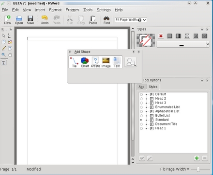
However, a good deal of the across-the-board graphical capacity is simply a reordering of existing tools to make them more accessible. For example, from the Add Shapes docker, you can not only select basic shapes, such as ties, chart, artistic text and text frames, but also choose from a miniature clip-art gallery that includes arrows, geometric shapes and callouts.
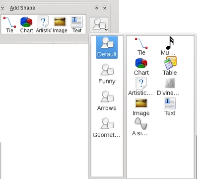
Figure 4. The Add Shape docker not only makes economical use of space, but also makes clear that everything you add to a document is treated the same way.
The vaguely named Styles docker provides a similar capacity for the backgrounds of objects. In a docker that is maybe 2" x .5" high on my laptop screen, the Styles docker gives you a selection of background colors, gradients, patterns and fills, or lets you remove them with a click of a button. These choices can be customized by selecting tools on the application pane, or sometimes, by making selections in other dockers.
As a side benefit, by having these graphical tools in most applications, KOffice also increases its common interface. The result is that both the applications in general and their new graphical capabilities in particular are quick to learn.
Another advantage of KOffice 2.0's interface is that basic concepts often become clearer. This change is especially obvious in KWord.
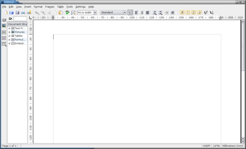
In 1.6.3, the latest officially released version, KWord's frame tools provided a tree view of document structure rather like the OpenOffice.org Navigator. However, this view was locked in place and too narrow by default even when KWord was maximized. Nor were the arcane icons for different types of objects beside the tree view very helpful to users. As a result, most users I have talked to ignore them. Many confess to hiding the tree view to avoid being intimidated by them.
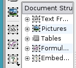
Figure 5. The document structure pane in earlier versions of KOffice confused as much as it enlightened. It's been replaced by dockers such as Add Shape.
Now, in KOffice 2.0, the concept of frames has been replaced with the less abstract and better-labeled ones of shapes—no doubt as a result of implementing the new Flake library. As in earlier releases, you still have to select a type then drag with the mouse in the editing window to create it, but now, with the default set of dockers, you are more likely to notice and use the tool.
Moreover, once you have created an object, you easily can use dockers like Geometry and Snapping to align and orient a shape or arrange it on a grid. Although the functionality is the same as in earlier releases, ease of use is far higher.
Just as important, because Add Shapes lists ties, charts, artistic text and pictures as possible selections, it reinforces the fact that all these possibilities are essentially the same kind of object so far as KOffice is concerned, and all can be manipulated in much the same way in the editing window. In other words, the Add Shapes docker makes clear a unifying concept in a way that separate sub-items in a menu or a collection of unconnected icons could never hope to match.
A second basic concept that becomes clearer in KOffice 2.0 is styles—the formatting equivalent of declaring a variable once and reusing it as needed. Most word processors have the concept of character and paragraph styles, but they vary widely in their emphasis on them. For instance, AbiWord and MS Office tend to make manual formatting more prominent, while OpenOffice.org requires the use of styles if you want to use many advanced features. In the past, KOffice has been closer to AbiWord than OpenOffice.org, including styles, but keeping them in the menus where they can be missed and their features buried several layers below the top menu.
By contrast, KOffice 2.0 edges closer to emphasizing styles. If you select the text tool from KWord's application pane, you have a Styles docker (not to be confused with the one for backgrounds that uses the same name) that places manual formatting of text and styles only a tab apart. At first, this arrangement might seem to give both approaches to formatting equal weight, but the truth is that styles have been so underemphasized that, just by making them more prominent, the Styles docker increases the chances that users will investigate the time-saving possibilities of working with styles. At the same time, unlike in OpenOffice.org, KOffice 2.0 does not compel users to switch from manual formatting if they choose not to.
KOffice 2.0 does have new features that stand on their own, such as additional functions for KSpread and the option to encrypt files while saving them. However, such enhancements seem minor compared to those in the interface. While altering KOffice under the hood, its development team also has made serious efforts to enhance the interface—so much so that the user experience is almost completely different in 2.0 from that of earlier releases.
Some of these changes work better than others. In particular, some of the names could be better chosen, at least in English. Apart from the potential confusion from having two dockers called Styles, some, such as the shapes library called Funny, simply seem inappropriate. Then too, the name dockers itself is always going to set North Americans to thinking of business-casual pants.
Still, KOffice 2.0's final release is less likely to be met with the same hostility that KDE 4.0 encountered. True, the possibility of some missing features remains strong—barring a last-minute coding blitz—and some users will complain about any changes.
However, although KOffice 2.0's changes are impossible to miss, they are far less radical than KDE 4.0's. They are not so much changes in the basic concepts you need to use the office suite as improvements in usability. Provided users are not immediately intimidated by the array of dockers, they should find KOffice 2.0 more accessible and quicker and easier to use than those of previous releases. These improvements make KOffice 2.0 a joy to use and more than justify the long wait for the final release.
Bruce Byfield is a computer journalist who writes regularly for the NewsForge and Linux Journal Web sites.


