Visualizing Science with ParaView
I'd like to introduce one of the more popular tools used for visualizing data within several scientific disciplines: ParaView. ParaView started as a joint project between Kitware, Inc., and Los Alamos National Laboratory back in 2000. The first public release was version 0.6, which came out in 2002. Since then, ParaView has become one of the most popular visualization packages for visualizing large data sets.
Because it's open source, it should be available in most, if not all, package repository systems. For example, in Debian-based distributions, you should be able to install it with the command:
sudo apt-get install paraview
Starting it the first time should give you an empty workspace, ready for you to get to work.
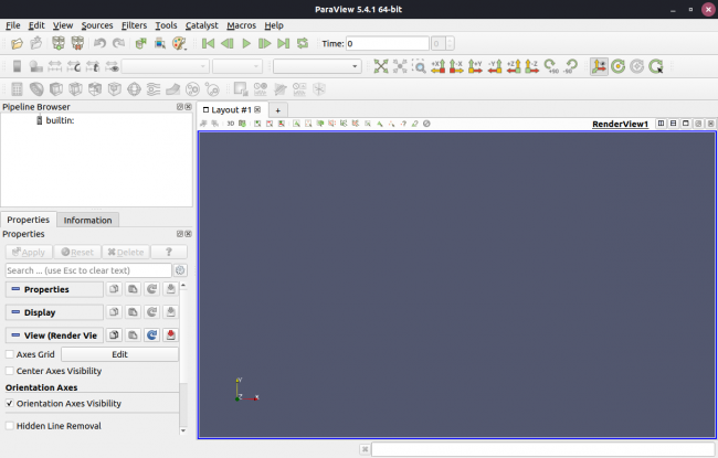
Figure 1. When you first start ParaView, you'll see a new, empty layout to start your visualization.
Two major parts populate the bulk of the window. The right-hand side is the main display pane where the visualization will appear. The left-hand pane shows the list of objects being visualized, along with their properties. At the top, there is a toolbar of the common functions in ParaView.
To play with ParaView, you'll need some data. If you don't have any data of your own to use, you can grab some data provided as part of the ParaView Tutorial. More documentation and sample scripts are also available there.
Let's assume you're going to use the sample data as you learn how to use ParaView. To load the data, click File→Open, and navigate to where you unpacked the sample data.
While you're here, take a quick look at the list of all of the file types ParaView supports. For example, you can load the data stored in the file can.ex2. You won't see anything displayed right away. In the bottom part of the left-hand side pane, you should see the properties for the newly loaded data file. For now, you can just accept the defaults and click the apply button. You then should see the data visualized in the main pane.
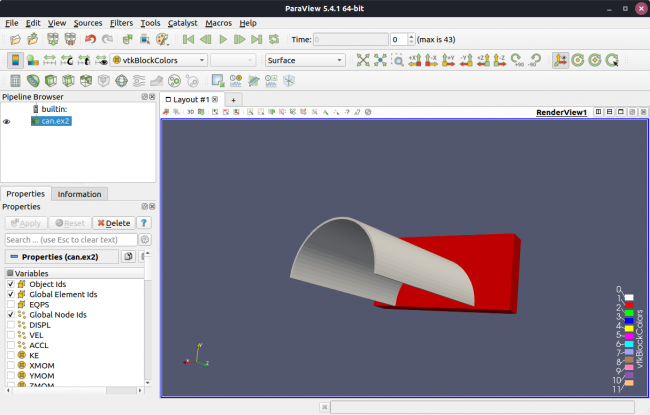
Figure 2. The data in the sample file can.ex2 renders as a half cylinder attached to a rectangle on the end.
Clicking and dragging on the image allows you to rotate the view, so you can see the entire object from various angles.
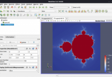
Along with visualizing data, ParaView includes a number of basic shapes you can use to build up structures within your visualization. Clicking the Sources menu item provides a fairly lengthy drop-down list of structures. And, you even can add more complicated structures (like the Mandelbrot set) to your visualization.
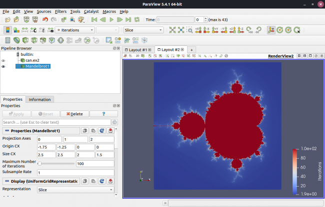
Figure 3. You can add lots of different objects to your visualization, even a Mandelbrot set.
This could be handy if you have some basic geometric structure or an image that you want to use as a backdrop to your data visualization.
If the data you're visualizing is more traditional (for example, if the data comes from measurements), ParaView provides actual data analysis tools to complement the visualization tools. For example, clicking the Filters→Statistics menu item provides a drop-down list of statistical functions. Clicking the "Descriptive Statistics" option adds a new entry in the "Pipeline Browser" where you can set the options for the statistical analysis.
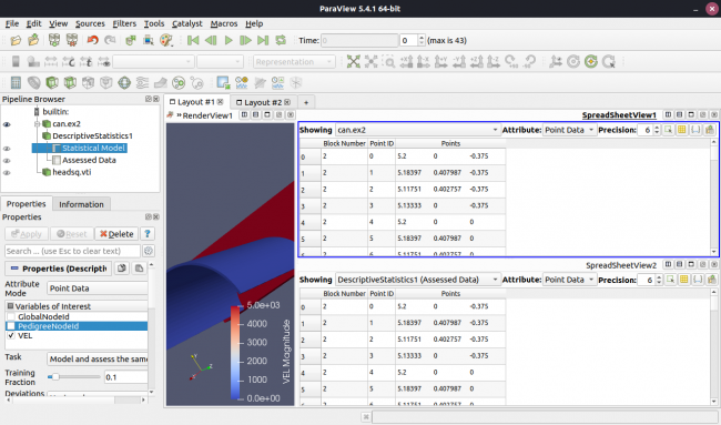
Figure 4. You can add statistical analysis to your pipeline of visualization steps in your analysis.
This opens a new pane where you can play with the data a bit more directly. This particular data set is not very interesting, so descriptive statistics aren't very useful in this specific case.
You also can do more detailed data analysis by clicking the Filters→Data Analysis menu item. For example, clicking the histogram entry gives you a new pane displaying a histogram plot.
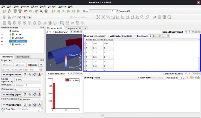
Figure 5. You even can do histograms of the data being visualized.
You also can do things like calculate quartiles or replot interpolated and analyzed data.
For repeated visualization, you probably won't want to go through all of the required steps every time. ParaView includes a Python engine, so you can write a Python script that can run repeated processing steps easily. This also means you can script behavior that can be processed when the GUI is not active. This comes in handy when you're running larger data analysis jobs on high-performance clusters remotely.
You can work on your Python scripting by clicking Tools→Python Shell. This pops up a new window where you can write and evaluate your Python code directly within ParaView.
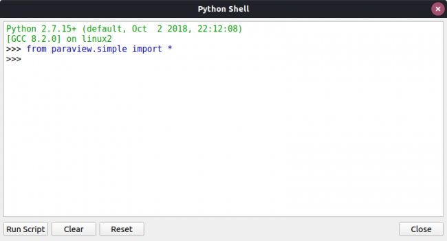
Figure 6. Within ParaView, you have access to a Python shell where you can interact with the ParaView analysis tools directly.
Along with writing Python scripts, ParaView has been designed with a plugin architecture. Clicking Tools→Manage Plugins pops up a new window where you can select which plugins are loaded and active.
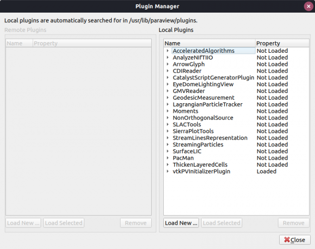
Figure 7. ParaView supports plugins, but it's up to you to select which ones are active and loaded for use in a current session.
If you're in the middle of some visualization work, you can save the current state of ParaView so that you can pick it up again later. Clicking File→Save State lets you save the current state as a .pvsm (ParaView state) file. You can reload it later by clicking File→Load State.
Once you've finished a visualization, there are a couple options that allow you to generate files that you can use in other software packages. Clicking File→Save Screenshot pops up a new window where you can set options like the image size. Then a second window will open where you can set the image filename.
The File→Export Scene menu item gives you a second option for saving your results. In this case, you can save your results in other file formats, such as PostScript or PDF. If your visualization includes an animation, click File→Save Animation to save it.
If you're working with large or complicated data sets, I recommend making the move to ParaView as your main visualization tool.


