Qt and Layouts

When I first started with graphics - I plotted pixels onto the screen by calculating a memory address and then poking the corresponding value. Times have changed since then. My murky history contains gwbasic, STOS, HiSoft Basic (compiled!), VisualBasic (numerous versions) until I found C and AES (on the Atari ST), Win16 (that is Windows 3.1) and even Presentation Manager on OS/2 (in the pre-Warp days).
Finding myself at university, I ran in to the Tru64 platform. That means Alphas and a Unix dialect that wasn't really compatible with anything that I knew. I dabbled with xlib and GTK but then some friends of mine and I set out to build KDE (the school provided FVWM). That meant building Qt along with loads of other stuff. This was a time when 64-bits was exotic - and guess what Tru64 runs on.
If our hands weren't full from just building the project, we also had to build it on a temporary drive as our accounts where too limited. That meant keeping the build times short enough to avoid the rm -rf that was run on the temporary area every night by sysop. We also had to place parts of the binaries in web directories and use symbolic links to get them into the tree spread over our home directories (there were some heated discussions when they realized what we did). The lesson for the sysop was to run quota on all disks - not just the /home tree...
Enough nostalgia, and on towards the point. Through all my previous experiences, graphics were placed at a specific pixel location. Usually relative to the upper left corner (i.e. base address of the framebuffer memory) or to the upper left corner of the current parent widget (i.e. inside a window). Windows complicated this by using dialog units, i.e. basing the locations on the font size.
Building Qt meant trying to use Qt, and this moved me beyond fixed pixel locations. I'm not claiming Qt was first, nor is best at this. As all great ideas, this must have been inspired from somewhere. In Qt (and GTK+ and most other modern toolkits) widgets (controls, elements, call them what you like) are placed in "layouts" and that is pure genious. By letting widgets hint about what size they want and then provide size policies, the layouts let the widgets negotiate for space.
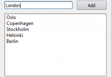
Let's take an example. The very simple dialog shown at the start of this article consists of three widgets: a text editor (QLineEdit), a button (QPushButton) and a list widget (QListWidget). All of them are placed in a grid layout (QGridLayout) with the list spanning two columns.
All widgets provide a size hint, i.e. some size information to start negotiations from. The size hint is usually calculated from the contents of the widget. The interpretation of the size hint can be: don't care, I'd prefer this but can go either way, this is my absolute minimum or maximum size, or this is my final size. Also, the interpretation can be different depending on the direction (horizontal or vertical).
Returning to the example dialog, the widget easiest to understand is the list. It returns a small hint, but wants to expand as much as it can in either direction. It is happy with what it can get, but wants as much as possible. This size hint interpretation, or size policy is called Expanding and is used in both directions.
The text editor and button both return hints based on the contents. Height wise, they are both single-line widgets (in this context) so the height is Fixed. The eagle eyed reader might even notice that the text editor is not quite as high as the button and thus centered vertically.
Horizontally, the button provides a Minimum size so that its text does not get truncated while the text editor takes as much as it can (Expanding). All these policies and hints are balanced by the grid layout to provide the dialog shown.
So, what are the benefits to layouts? I can see three obvious cases:
- Internationalization - "Add" is "Addera" or "Lägg till" in Swedish. That requires a larger button - something that the layout can handle without requiring changes to the dialog.
- Screen resolution changes - i.e. larger fonts (in pixels) are handled automatically by layouts, again without needing to change the dialog.
- Stretchable user interfaces - if the list were to contain long file paths, the user can simply stretch the dialog to reveal the entire path and the dialog controls stretch with it. Without layouts you end up scrolling or simply missing out.


