Kde 4.7 Released And In The Wild

July saw the release of KDE SC 4.7. Like all recent KDE releases, this is a combination of updates to the bundled applications, underlying desktop and associated technologies. Canonical have already pushed 4.7 through to Kubuntu desktops.
If you are a 4.6 user who has just upgraded, don’t expect to be aware of major changes the first time you reboot. Some of the core applications have been updated, but most of the work has gone into improving the underlying frameworks. The applications themselves have been shifted to a greater reliance on Akonadi, the PIM storage framework and NEPOMUK, the semantic information database.
Kontact is the KDE PIM suite that includes email, contacts and appointments. Again, don’t expect to see many apparent differences when using the applications as most of the changes take the form of a switch to Anakondi for data storage. The mail component, Kmail is an example of this as it has been rechristened Kmail 2, although it looks almost identical to the previous version.
Of course, the the usual caveats about relying on a database rather than standard file formats have to be considered. On the one hand, it’s not quite clear what happens if you have to recover a broken system as you can’t simply peer inside a set of standard files. On the other, a unified approach looks set to pay off in the future, and it was always part of the over-arching plan for KDE4.
Increasingly, if you update contact or scheduling information in one application, that information will be updated in every KDE application, and this will include all of your synchronized devices and services. However, if you’re the type of user who prefers to use a suite of independent applications that utilize industry standard methods of storing their data, the KDE of the future isn’t going to be for you.
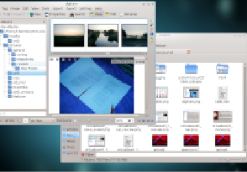
Photo manager, digKam is once again a core application, and it’s an example of an application that does have improvements that are visible on the surface. As for the application itself, it will probably continue to be divisive. On the one hand, it harks back to the KDE3 era in that it is a complicated application with loads of features. On the other hand, it’s at odds with the KDE4 aim to simplify user interfaces wherever possible. I’d challenge anyone who has not used it before to be able to figure it out at first glance, in contrast to the intuitive layout of F-Spot or Picasa. It’s a techy application application rather than a pure photo browser, and some people will want to see it stay that way.
digiKam - it's complicated.
File manager Dolphin is an application that has had its user interface simplified slightly and can now operate without a menu bar. Looking at the screenshots that demo a few different configurations, I have to say that I’m still not much of a fan. All files are still locked to a grid and the icons are uniform in size. Its predecessor, Konqueror managed to mix icons of varying sizes with larger icons for media that could be previewed as a thumbnail.
Dolphin. The way it handles previews still hasn't won me over.
I wonder if I’m the only long-term KDE user who hasn’t delved into what task orientated workspaces have to offer? For one thing, I want to be sure that it all works flawlessly before digging in. Perhaps I’m just getting old.
Conclusion
On the surface, KDE4.7 might seem like a minor upgrade, however, a lot of work has been carried out improve the frameworks such as Phonon, NEPOMUK and Anakondi. This release leverages the power of those frameworks to take KDE4 closer to what it was always intended to be, a closely integrated set of applications and services tied together with a user interface that it is easy to use. What KDE4 represents won’t, therefore, please all Linux users or even all desktop Linux users.
Having overcome the difficult birth of the initial release, KDE4 is now a powerful and mature desktop. In the future, in some respects, it will pull further away from what traditionalist Linux users expect from a desktop experience, and on the other hand, KDE4 will soon begin to offer integrated approaches and ways of working that make it stand out against all of the other desktops that are available.
The complete overview of changes on the KDE website seems to be split onto three main pages: applications, Plasma Workplace and the underlying platform changes.


