Graph Any Data with Cacti!
For the past few years, I've been trying to understand how to make graphs using RRDtool (Round-Robin Database tool) after failing miserably to understand MRTG (Multi-Router Traffic Grapher) before that. The thing I like about RRDtool is that it's newer and supports a wider variety of data sources. It's still incredibly complicated though, and I've given up on learning how to use it on multiple occasions. That's when I discovered Cacti.
Cacti is not a new program. It's been around for a long time, and in its own way, it's a complicated beast itself. I finally really took the time to figure it out, however, and I realized that it's not too difficult to use. The cool part is that Cacti makes RRDtool manipulation incredibly convenient. It did take me the better part of a day to understand Cacti fully, so hopefully this article will save you some time.
The Goal
I want to create a graph that graphs something automatically and does it using a bash script as the input as opposed to SNMP or anything like that. I've been using bash for years, and I'm comfortable using the command line to procure data. In fact, for this project, I'm going to adapt a script I use for BirdTopia (my continual birdcam project for the past few years) that will pull a temperature from the command line. I want to pull the temperature from two different cities and graph them together. For this example, I use Petoskey, Michigan (where I live), and Houston, Texas (where Linux Journal headquarters are located).
Here's the script:
#!/bin/bash
curl -s "https://api.wunderground.com/weatherstation/
 ↪WXCurrentObXML.asp?ID=$1" \
| grep temp_f | sed 's/.//' | sed 's/.//' | sed
 ↪'s/<temp_f>//' | sed 's/<\/temp_f>//'
It looks complex, but really it just downloads the API information
from Weather Underground for the weather station given as an argument,
and then uses sed (stream editor) to pare down the information to a
simple number—specifically, the numerical degrees in
Fahrenheit. If you
prefer Celsius, I applaud your country for adopting the metric system,
but sadly, my brain just can't relate Celsius to how warm the outdoor
temperature feels.
One tricky part is figuring out what the proper weather station ID is for your city. I wish you could just use a ZIP code, but I've been unable to find a command-line weather API that will take a ZIP code. So if you're following along, just head over to Wunderground and load the page for your locale. Once there, click on the link shown in Figure 1 (your text will be different, but the location on the page should match). The next page will show the name of your local weather station. You can see mine in Figure 2.
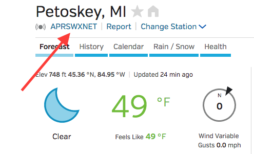
Figure 1. I assumed this was my weather station, but it's not. You need to click through to find the code.
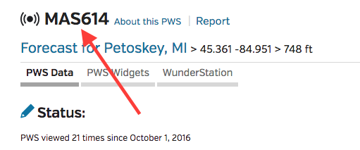
Figure 2. Here is the code for my local weather station. Be sure to try your script on the command line to see if you have the correct code.
To get the local temperature using the script, just type the name of the script (I named my "gettemp" and saved it as an executable in /usr/local/bin/) with the name of the weather station as an argument:
spowers@cacti:~$ gettemp MAS614
48.0
spowers@cacti:~$
The same script will work for Houston's weather too. I looked up a weather station name in Houston and found "KTXGALEN6" as a name. Using that as the argument, I can get the current temp for Houston. And, those will be my two points of data.
How Cacti Works
This is honestly the most frustrating part of the process. There are so many different pieces to the Cacti puzzle, that it's easy to give up. Go ahead and install Cacti on your system (it should be in the repository), and log in. The default login is usually "admin" for both login and password. You should change it immediately.
Once there, look along the left-hand side of the "console" page (Figure 3), which should load by default. The confusing part is that names like "devices", "data sources", "data queries" and such all sound like what you want to configure to get data. I'm listing the definitions below, so hopefully it's less confusing:
-
Data Queries: this generally refers to SNMP queries used to get data. I'm not using this here, even though it sounds like something I'd need to configure for doing data queries to a bash script.
-
Data Input Methods: this is where you'll configure your bash script if you're following along. Cacti sees the script as a way to get data, not the data itself. This means you can use the script (or Data Input Method) for multiple data sources. In my case, I use the same Data Input Method for both Petoskey temps and Houston temps.
-
Devices: Cacti allows you to categorize data by device. This makes sense if you're going to monitor server data from a bunch of different servers. In this case, I'm not graphing different devices, so I won't use the device categorization at all (I'll use "none" as the device).
-
Data Sources: a data source uses a "Data Input Method" to create a graphable piece of data. For this example, I have two data sources: the Petoskey temp and the Houston temp.
-
Data Templates: this is a template that instructs Cacti on how to use a Data Input Method to create a Data Source. Basically, you set up a Data Template so Cacti knows what questions to ask when creating a Data Source. It's possible to do without a Data Template, but if you don't set one up, Cacti will give errors when creating a Data Source that you'll need to go back and fix later. It's a real pain, but the step to create a Data Template makes the process far less painful.
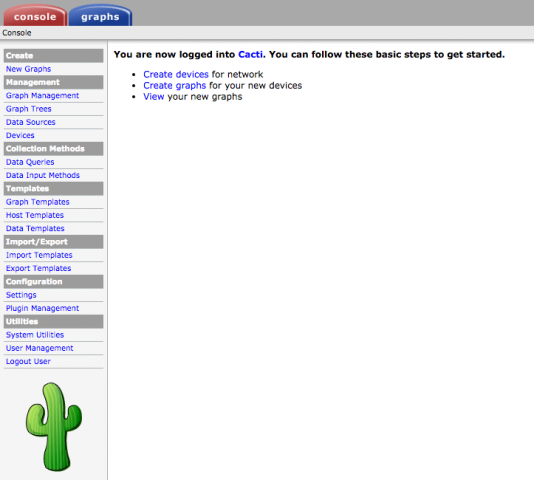
Figure 3. Don't be overwhelmed; it's not nearly as scary as it looks.
Hopefully, that clears up some of the strange terminology. Graphing is actually separate, so first you need to get your Data Sources configured. (You'll make the graphs from your data sources, once they're storing periodic data.)
Part I: Data Input Method
For this example, even though I have two data sources, I have only one Data Input Method. That means I need to configure the script in Cacti so that it will accept an argument (the weather station code) for each data source. So to do this, first click on "Data Input Methods" on the left, and then click "add" on the upper-right corner of the Data Input Methods page. Look at Figure 4 to see where the "add" link is, because it took me a long time to find it at first!
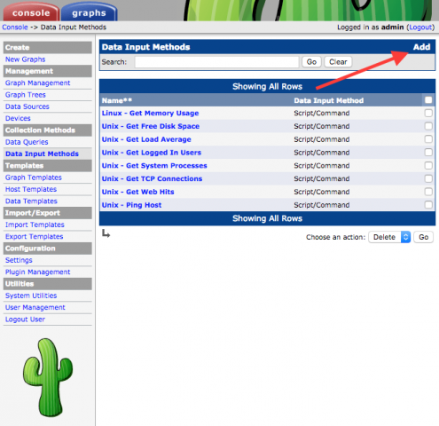
Figure 4. It took me forever to figure out how to add something. I felt very silly.
This is where you create the criteria for Cacti to "call" your script. Figure 5 shows how to set up the information. Note that you must use the "Script/Command" Input Type and that the placeholder for the argument goes in < > brackets. The name of the Data Input Method is just a friendly name, and the command-line argument in brackets gets a friendly name too. (Also note that Cacti refers to the command-line argument as an "input source", which isn't terribly descriptive in the case of a bash script.) Once filled in, click Create at the bottom.

Figure 5. Be sure to select Script/Command!
The next page (Figure 6) looks similar, but you'll see that there are now two more sections you need to complete. The first is the Input Fields section. Click Add in the upper-right corner of that section, and then tell the system what the script expects as input. In Figure 7, you can see the Input Field from the last step is already selected. My example script has only one argument, so it's the only option to choose. (Notice the name is the same that I put in <brackets> in the last step.)
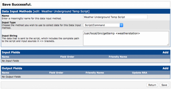
Figure 6. You need to configure an Input Field and an Output Field.
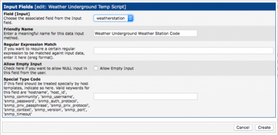
Figure 7. These error-checking features will come in handy for some scripts.
I added a friendly name for the Input Field, so when I'm configuring the Data Sources later, it's clear what Cacti is looking for. If you want to get fancy, you can use regex to sanitize the input, but I'm leaving that blank. Also, since the script won't work without the weather station code, I made sure the check box to allow empty input is not checked. The last field also doesn't apply in this case, so I left it blank. Once you've chosen a friendly name, click Create.
Next, click the Add link in the upper-right corner of the "Output Fields" box. You'll be taken to a screen that looks like Figure 8. Here, you're basically applying a label to the output from your bash script. For this example, I know I'll be getting a number, so in the first field, I just called it "degrees", and then I added a friendly name that described the output. The "Update RRD File" is checked by default, and make sure to leave it checked. That's how Cacti knows this will be a graphable point of data! Once complete, click Create.

Figure 8. Just use a name that makes sense.
Your Data Input Method screen should now look like Figure 9. Be sure to press Save at the bottom right of the window; otherwise, you'll lose all of your work. If you click on "Data Input Methods" on the left column, you should see your script added as a new Script/Command. Next, you can use that Data Input Method to create your two data sources.
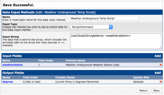
Figure 9. Be sure to save!
Part II: Data Templates
If you head over to "Data Templates" in the left column and click Add in the upper-right corner, you'll be presented with a screen that looks similar to Figure 10. The idea behind a template is to answer as many questions as possible, while leaving blanks for those items that will be specific to each Data Source configured with the template. Looking at Figure 10, note that I gave the template a friendly name at the top. The next field, under Data Source, I left blank, but I checked the box that says "Use Per-Data Source Value", because I want the two data sources to have different names. (It wouldn't be very useful if they both had the same name.) Checking the box tells Cacti that when people use the data template, you want them to come up with their own name. The "Data Input Method" is the one you created if you were following along in Part I—just find it in the drop-down list. "Associated RRAs" tells Cacti which sets of data it should track. Be sure to select all of these, because you want to be able to create multiple graphs for historical data. Then, "Step" refers to how often it should poll the script for the temperature. The default is five minutes (300 seconds), and I recommend leaving it. Finally in that section, be sure "Data Source Active" is checked so that it actually stores the data. Note that the last two fields in that section are not checked to use "Per-User Data Source", because I want those values to be the same for any data sources created with this template.
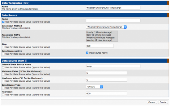
Figure 10. Data Templates make it so much easier to create Data Sources.
The next section refers to the data items inside the RRD (round-robin database) file. Since I'm tracking the temperature, I just decided to call the field "temp" inside the file. I also don't want a maximum or minimum value, so I put "U" in each of those fields. The "Data Source Type" field refers to the kind of data stored. In this case, it's a value that fluctuates, and I want to compare the difference between them on a graph, so the "GAUGE" type is what I want. Feel free to explore the other data types, but for monitoring and graphing something like temperature, GAUGE is what you should use. Finally, the "Heartbeat" field tells Cacti how long it can go between data entries before it needs to fill in data points with "unknown" (this defaults to ten minutes, and I suggest leaving it). Also note that none of the "Use Per-Data Source" check boxes are marked, because these values will be the same for any data source using my script. Click Create, and you should see Cacti provide another field to fill in (Figure 11).
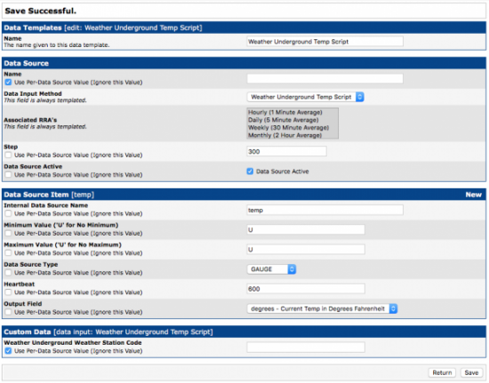
Figure 11. Remember to fill in as much as you can, and check those boxes that should be unique to each data source.
The "Custom Data" section that appears at the bottom comes from the Data Input Method that requires an input (the weather station code). Since I want each data source to use its own code, I check the box to use "Per-Data Source" and leave the field blank. Click Save, and the data source should be configured and ready to use.
Part III: Data Sources
Now that you have the Data Input Method and a Data Template to tell Cacti how to use it, you need to create your two data sources. Head over to "Data Sources" on the left, and then click "Add" in the upper right in order to add your first source. The first page asks you to select a Data Template and Host. This data source isn't related to a specific server, so leave Host as "none", but you want to select your freshly created Data Template (Figure 12) and click Create.

Figure 12. Cool, the data template!
Since the Data Template already answers most of the questions about the new data source, you're asked only a few details. In Figure 13, you can see that I need to name this data source, choose a data source path and give it the weather station code. I just used the default Data Source Path that Cacti created. Once you enter the name and weather station code, click Save.
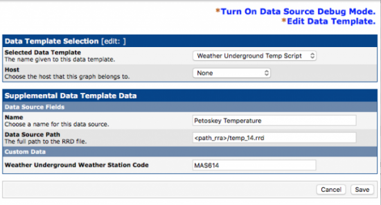
Figure 13. See? It's much easier to create a data source when you have only two things to enter!
If you're following along and want to do something similar to me, repeat the process for your second weather station. Since the Data Template is already in place, adding a second Data Source is very simple. I added Houston exactly the same way as I added Petoskey.
Part IV: the Graphs
Creating the Data Sources is really the hardest part of creating graphs with Cacti. Once they're created, the data will be polled every five minutes, and data will be added to the RRD files. You can't create a graph until you have a Data Source created, because graphs simply show the data inside the Data Sources graphically. So, now that you have Data Sources, you can create graphs to display them.
It's possible to set up Graph Templates, but unlike Data Templates, they're not really required. In my case, since I created only one graph, it would take longer to set up a template than simply to create a graph from scratch, so I'll just do it from scratch. In order to start, click on "Manage Graphs" on the left-hand side of the screen. (Note: don't click "New Graphs", because for some reason, Cacti will try to use a host and not give you the option for selecting a Data Source that doesn't have an associated host. Thankfully that isn't a problem in the "Graph Management" section.)
Once in Graph Management, click "Add" in the upper-right corner. Select "None" for both host and template (Figure 14), because you're not going to use a template for this graph. Then click Create.

Figure 14. Graph Templates won't save you any time, but if you're doing lots of similar graphs, check them out.
The next page (Figure 15) looks overwhelming, but you're going to leave almost everything at its default. The only things I added were the Title of the graph (Petoskey & Houston) and, at the bottom, the Vertical Label (degrees Fahrenheit). For your first graph, I recommend leaving everything else at its default. Click Create.
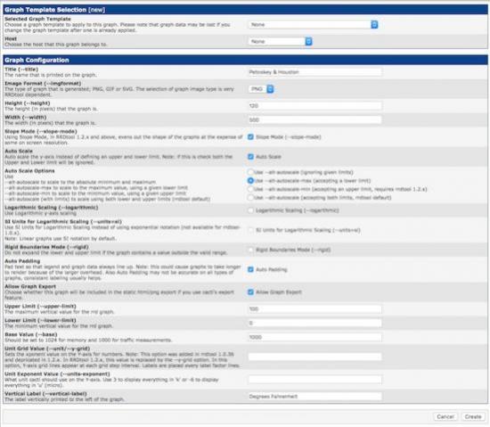
Figure 15. Thankfully, you want mostly all defaults.
The next page (Figure 16) looks similar, but notice the section I circled in red titled "Graph Items". You need to click "Add" on the right in that section, and add the Data Sources. You'll see I chose "Houston Temperature" as the Data Source to graph (Figure 17).
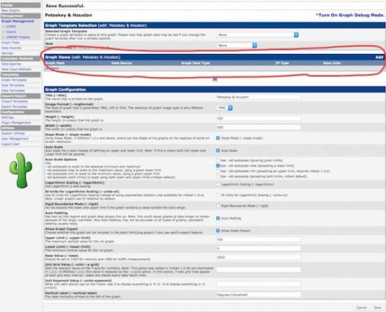
Figure 16. I missed this section at first and was confused why I didn't get any graphs.
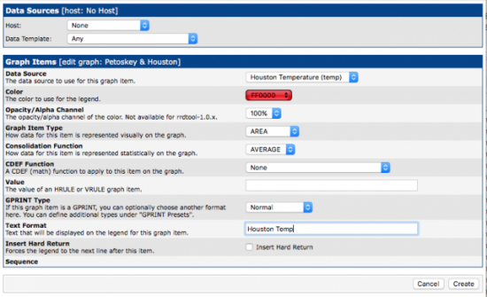
Figure 17. Why on earth does the drop-down box show only HEX?
The second field is to choose a color for the graph. Irritatingly, the drop-down menu shows only HEX codes for colors, but after you select one, it displays the color for you. Houston is generally hot, so it seemed appropriate for it to be red. Next is opacity, and I chose 100%. The "Graph Item Type" does not default to "AREA", so be sure to select that for a traditional graph that looks like a rolling hill of data. It's safe to leave "Consolidation Function" to AVERAGE, and everything else the default. I did add "Houston Temp" to the Text Format field, so it shows which color is which Data Source on my graph. Once you're happy with the data, click Create. Do the same thing with your second Data Source. You'll notice in mine (Figure 18) that I chose blue for Petoskey, and instead of AREA, I chose LINE1. It's a different type of graph, so that instead of filling the page, it will draw a line with the temperature. I did that so Houston would fill the background, and Petoskey would draw a line over the top of it, so you can see both. Figure 19 shows the preview of what the graph will look like. Be sure to click Save at the bottom!
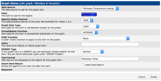
Figure 18. Blue seemed appropriate for Petoskey.
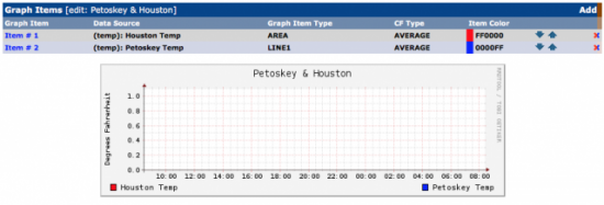
Figure 19. Looks like the graph is configured. (Don't forget to click Save.)
That's It!
The only thing left to do is wait. Every five minutes, there should be a data point added, and the graphs will update with a graphical representation of that data. Cacti allows you to export the graphs to a local path (like /var/www/html) or to a remote FTP server. If you don't have it export the graphs, you'll have to log in to see them. I won't go through the process for exporting the graphs, but click on the "settings" link on the left column, and then the "Graph Export" tab across the top. The setup is fairly self-explanatory. To see the graphs you've just created, wait 10–15 minutes, then follow the arrows as shown in Figure 20 to find the graphs. You should see your new graphs starting to populate themselves with data!
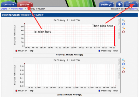
Figure 20. These are frustrating to find; hopefully the arrows help you.
Cacti has lots of other features, and it allows you to customize your graphs with min/max values displayed on the graphic, along with different types of graphs, data sources and so on. Once you become familiar with using it, Cacti is a very nice tool for automating the graphing process. I hope you have as much fun with it as I did!


