Gnome 3.2 More Evolution than Revolution

Gnome 3.2 has been released. This time around, the developers have focused on a large number of small improvements rather than big, headline features. That said, there are a couple of interesting new additions in the areas of web integration and personal data management.
Adhering to a six month release schedule, this is the first major Gnome release since version 3.0 debuted in April this year. Rival desktop environments KDE4 (released Jan 2008) and Gnome 3 have something in common in that they were both quite heavily criticized upon release. However, the situation isn’t exactly the same because KDE 4.0 was, arguably, unusable upon release in addition to being a huge departure from the previous series. By contrast, most of the criticism of Gnome 3 has centered on the new user interface and seems to be subject to personal taste. Therefore, it’s not surprising that most of the work seems to have gone into improving refining the new shell.
Sure enough, in the opening section of the official Gnome 3.2 announcement, entitled “Evolution” we are told:
“Based on user feedback, lots of small changes have been made to give a smoother experience in GNOME 3.2.”
See the appropriate section of the the release notes for the full list of improvements. Notable additions include the new Contacts application, the instant image previews in the file manager and the new color management feature. Generally, everything has been spruced up, refined or subjected to greater integration with the whole.
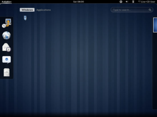
The default theme is a dark one, and overall, Gnome 3.2 now shares quite a bit with KDE4 in the looks department.

Dark blue hues are prominent in the default scheme of the Suse Gnome 3.2 Live CD.
However, despite the focus on refinement rather than new features per se there are two fairly major new features that both relate to web integration.

Sticking with plan A: The old task bar and application launcher of Gnome 2 have been replaced by icons that run down the side of the screen. Some love it; some hate it.
Online Accounts
Online Accounts is a system that allows the user to store application data using web services as a back end for email, calendar, contacts, chat and other resources. I have no doubt that the idea of having separate contacts and other personal data for every service will soon seem old-fashioned, and the aims of the project are clearly similar to KDE’s Akonadi. As it stands, Empathy, Evolution and the new Contacts application can make use of this system and various Google services and Twitter can serve as the data source.
Although the feature is still nascent, I’m going to go out on a limb and say that it doesn’t seem like the extensive, all-pervasive framework that Akonadi is. Having said that, and for that reason, I don’t think that its introduction will create the same reliability problems that Akonadi did when KDE4 applications first began to make use of it.
Web Apps
The second new web-based technology is a feature that enables web applications to open directly onto the desktop. You may remember that we explored this approach before with our overview of Peppermint OS. The new Gnome feature works in much the same way. Web applications can be added to the standard application launcher menus. Subsequently, they run within a seamless web browser, making them look more like native applications. One benefit of running web applications in this way is that if the seamless window running the application should crash, it doesn’t crash the main, tabbed web browser that you were using to browse the web.
Conclusion
Gnome 3.2 is largely an improved version of what we already had. If you’re a fan of 3.0, you’ll be happy with the upgrade. Those of you who disliked 3.0 will probably not be persuaded by this new version. Switchers from other systems such as Windows will probably be intrigued to learn that the Linux desktop is far from being a clone of what they are used to. As I've said before, LXDE and XFCE may well come into their own in the coming year as increasing number of people decide that they prefer a “classic” desktop to a fully integrated desktop environment.
Ubuntu 11.10, released on October 13th, is an example of a Linux distribution that will sport Gnome 3.2 as the front end.
If you want to try Gnome 3.2 out before it hits the major distributions, try this Suse based LiveCD (Link correct on 30 Sep 2011. Subject to change).
There is a PPA that allows you to add 3.2 to earlier Ubuntu distributions, but I didn’t have much luck at getting it going. It’s worth a try in a virtual machine if you are able to roll back to an earlier snapshot, but it’s definitely not worth the risk on an important installation.
These are the official release notes for Gnome 3.2


