The Motorola DROID

“But does it run Linux?” is a common refrain in some circles whenever a shiny new gadget hits the streets. In the case of the Motorola DROID, I am pleased to say it does, in the form of Google's Android mobile operating system version 2.0 (running Linux kernel version 2.6.29).
With its big, beautiful screen, fast processor, full qwerty keyboard and utilitarian looks, is the DROID a serious contender for the smartphone crown or just another pretender that's too little, too late?
Let's cover the basics first: call quality. It is a phone, after all. As a longtime user of another carrier and having had no prior experience with Verizon, I was pleasantly surprised by just how good the DROID (and the Verizon network) sounded. The improvement was noticeable to people I speak to regularly. The external speaker is well suited to its primary roles of speakerphone and ringtone playback, and it actually does a really nice job in media playback as well (an obvious lack of punch in the low end notwithstanding).
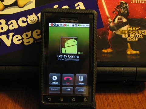
The dial pad is clean and well spaced, with large buttons. Once connected to a call, the buttons for doing useful actions (speaker, mute, three-way call and so on) are right where you need them to be (Figure 1). There isn't much else to say here. Making and receiving calls is straightforward and simple.
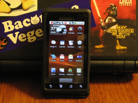
The screen is the first thing that catches your eye, and it definitely warrants the attention—in a word: stunning. In a side-by-side comparison with that other smartphone, the DROID screen is bigger, brighter, crisper and more clear (Figure 2).
Scrolling and dragging are smooth and fluid. The haptic feedback (feedback technology that interacts with one's sense of touch, for example, via vibration), where implemented, provides just the right amount of “buzz” without being distracting. The response to tapping is good, as long as you remember to use your fingertip and not your fingernail. “Tap” response does seem to taper off a bit near the top of the phone (when holding it in portrait mode), but I've noticed this really only in one application, so I'm not sure if it is the screen or the app.
One thing the DROID screen doesn't do is multitouch (multitouch technology allows user interaction by touching the screen in more than one place at the same time). This “shortcoming” has been well documented, but I haven't really found it to be a big deal. I am sure my opinion would be different if I were used to using a phone that did support multitouch.
Although not quite a holy war like with vi vs. emacs, the presence (or absence) of a physical keyboard is definitely a polarizing factor among smartphone aficionados. Based on my previous experience with touchscreens, I knew going in that I wanted a physical keyboard, and this one, for the most part, hasn't disappointed.
To expose the keyboard, simply slide the screen up. There's no springs or hinges, just a satisfying click when fully opened or closed. The lack of hinges or springs is, in my opinion, a positive, because it lessens the chances of having a “loose screen” result from a worn-out mechanism. It also means less moving parts to break.
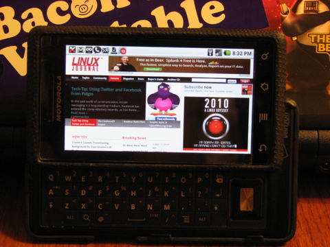
The keyboard itself takes up about three-quarters of the full width of the phone, with the remaining quarter being lost to the slide mechanisms, the microphone and a directional pad, which functions just like the arrow keys on a standard keyboard (Figure 3). The presence of the directional pad, much like the “chin” on the G1, makes right-hand placement a bit awkward initially; however, it took only an hour or so of use to adjust. A person with smaller hands may need a bit more practice to adjust, however.
All of the keys are the same size, with the exception of the spacebar, which is three keys wide. The lack of a physical space between the keys was a concern initially, but is no longer. Each key is bubbled up slightly in the center. This subtle rise in the center of each key makes it easier to differentiate between one key and the next as your thumb slides across the board.
The keyboard is a standard qwerty layout, with each key having an alternate function. The presence of both an Alt and a Shift key in both bottom corners makes it very easy to switch lowercase, uppercase, numbers and symbols. The inclusion of physical keys that replicate the touchscreen Search and Menu buttons is a nice touch, as it allows you to use these functions while keeping your hands in typing position.
The most unusual thing about this keyboard is the presence of two unused “keys”, one each in the absolute bottom left and right corners. It'd be great if they were user-programmable, but alas, they don't even click. Although this isn't really the kind of thing you expect to see on a finished product, I haven't found myself reaching for a key that isn't there, perhaps with the exception of having a Ctrl key available when using an SSH client.
In addition to the physical keyboard, there are also four buttons on the touchscreen: Back, Menu, Home and Search. Back does exactly what you'd expect, as does Search. Home drops you back to the main (center) panel from whatever you were doing, and Menu opens the options and settings menu in most applications.
Besides the keyboard and soft keys, the DROID has three additional physical buttons: the power/lock switch, a volume toggle and the camera button. The power/lock button functions exactly as it should. The same can be said of the volume toggle, which is smart enough to adjust the volume of whatever you're doing at the time (that is, call volume, ringer volume and media playback volume). The placement of the volume toggle does make it difficult to adjust the volume when the keyboard is exposed.
I've seen some very nice photos taken with cell phones, and I've seen an equal number, if not more, of really bad ones. Because of this, I really had no way to gauge my expectations for the DROID camera. Now that I've had some time with it, I think the best way to describe it is that the camera can, in certain situations, take really nice photos.
The hardware is certainly there: 5 megapixel camera, dual function flash and a physical shutter button that is located on the top-right side—just like a point-and-shoot camera when holding the phone in landscape mode.
It is the software and interface where things aren't as positive. Upon first launch, I was very disappointed to see that the camera interface was inconsistent with every other application. A push of the Menu button while in camera mode doesn't launch the settings/options menu. Instead, it launches another menu from which you can access the settings. When opened, the settings panel slides out from the left of the screen, instead of from the bottom like in all other apps. Those were my initial thoughts, but after using this for a while, I am starting to think that the arrangement of the menus and controls was a deliberate attempt to make them easier to use when holding the phone as a camera (landscape). If that's the case, kudos to the Android development team for considering how it will be used and not just blindly making all the apps the same. My praise for them is diminished, however, by the fact that it still doesn't work in a manner consistent with what you would expect. As an example, say you've opened the settings panel, then selected the flash settings submenu and changed your flash-mode preference. At this point, tapping the back button closes out all menus and takes you back to the main camera mode. In contrast, my expectation (and the behavior for every other app on the phone) is that tapping the back button while within a menu tree simply takes you up one menu level. This may not sound like a big deal, but the extra steps are a drag if you're trying to change more than one setting in a hurry.
Although the menu navigation can be tedious, the most unfortunate and disappointing drawback with this camera is the lag between button push and shutter fire when in autofocus mode. The lag actually seems more pronounced when using the physical shutter button than when using the soft (on-screen) button. This lag can be avoided by switching the focus from auto to infinity. The trade-off is, of course, that you lose the benefits of the autofocus. I don't know if the lag is something that can be fixed in software, but if it is, let's hope the developers are paying attention.
Regarding shooting mode, the camera has all the usual ones you'd expect on a typical point-and-shoot camera: auto, portrait, action, snow, beach, indoor and so on. It also has the usual palette of color effects: black and white, sepia, negative, red, blue or green tint and so on.
This certainly isn't meant to be a harsh indictment of the DROID camera. As I said, in the right circumstances, this camera definitely is capable of taking a nice photograph. But, let's keep in mind that this is a camera that's been added on to a phone and not the other way around. At the end of the day, you aren't going to replace your DSLR with the DROID (or any other phone for that matter).
The battery and memory card are housed in a compartment accessible through a removable panel on the back of the phone, and both are user-replaceable. The memory type is microSD.
The headphone jack takes a standard 3.5mm plug and is mounted in such a way as to require no special adapters or extenders.
Data transfer and battery charging are done via USB. The port on the phone accepts a standard micro USB 5-pin male connector.
These may seem like minor details; however, they bear mentioning because they are features that aren't always found on other smartphones. These choices, I believe, are a nod to consumers who are tired of over-paying for accessories and tired of guessing which USB cable in the drawer has the right connector for the device at hand.
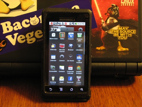
The DROID has three panels (think desktops) to hold the most commonly used applications and widgets. Switching between them is as simple as a flick of the finger. When started, the center panel is populated mostly with communications apps (Phone, Contacts, Gmail, Text, Gtalk, Calendar and so on) and, of course, the search widget. Access to the full menu of applications is available via a shade window, which slides in from the bottom of the screen (Figure 4). A long press on an open area of the panel brings up a menu from which additional application shortcuts or widgets can be added. A long press, hold and drag is all that is needed to move icons around on a panel, or from panel to panel. A long press and hold also temporarily turns the application menu button into a trash can, should you decide to remove an app or widget from the panel.
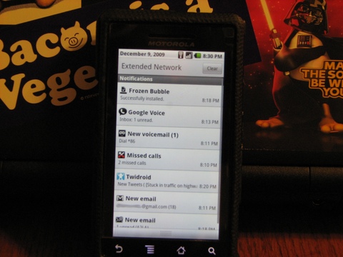
One thing that makes the Android interface really stand out is the Notifications shade. The unsuspecting gray bar along the top of the screen that displays time, battery status, signal strength and network status also displays application notification icons (new voicemail, missed call, unread e-mail and so on). With a flick, however, the shade unrolls to fill the screen and provides additional information about your notifications (Figure 5). At a glance, you can see the first sentence of unread e-mail messages, texts or tweets. You also get details on downloads that have completed, application updates that are available or Wi-Fi networks in the area. A simple tap on a notification will take you right to the application. I was pleasantly surprised to discover that the notification system works equally well with third-party apps as it does with Google applications.
Because this is an Android phone, you would expect integration with Google's various services to be tight, and it is for some services. For others, it's nonexistent or inconsistent. A single sign-on the first day I had the DROID gave me Gmail, Google Calendar and Gtalk at my fingertips without a second thought. Because of this seamless integration, I was expecting similar ease when visiting Google Docs and Google Reader via the native browser, but I was disappointed. I concluded that this was a security measure related to the fact that the first three are standalone apps, while the last two run in-browser. Yes, this explanation made sense until the first time I visited Google.com and discovered that I was signed in by default. The bigger question is, of course, why native apps for Docs and Reader aren't available.
Like anything from Google, the search functionality is quite good. The interface is consistent across all apps (even third-party) and uses predictive text, as well as your search history, to begin presenting results as soon as you start typing. Voice search performs well, provided you speak clearly and limit background noise.
The ability to run multiple applications at the same time is another feature that sets DROID apart from most of the other smartphones on the market. The classic example of opening a Web page, leaving to check e-mail and returning to find the page fully loaded works as advertised. As a more challenging test, I started Google Navigation and had it provide me turn-by-turn directions for my route. I then started playback of the Linux Journal Insider podcast. I wasn't sure how DROID would manage the conflicting audio streams, but it did the sensible thing by allowing the navigation prompts to interrupt Shawn and Kyle at the required times.
The DROID comes pre-installed with a fairly well-rounded collection of productivity, entertainment and social-media applications. More notable than the applications that were included, however, were those that weren't. The three most glaring omissions being a weather application (or widget), a Twitter application and a file browser. Fortunately, good third-party solutions exist for all three.
Regarding third-party applications, the Android apps store has convinced me that more isn't always better. After many hours browsing the store, it appears as though there is enough variety to cover just about everything you'd want to do with your phone (and probably a few things you wouldn't). For me, I've had no trouble finding applications for most of the things I've wanted to do. The one shortcoming is the availability of applications for certain popular Web services. This is beginning to change, however, even in the short time that DROID has been on the market.
In searching the app store, I've come across a couple applications developed by Google that aren't on the phone by default, but probably should be included. The first is Listen, a podcast aggregator that includes the very nice feature of allowing downloads right to the DROID over 3G or Wi-Fi (although the app warns of the potential for data-overage charges if you use 3G) and even allows you to begin playback before the download is completed. The second is a client for Voice, Google's telephony power tool, that is available by invitation only. Google Voice users know it's a nice way of managing your voice calling and SMS through one common interface. Once available to the public, Google Voice definitely should be a standard part of the Android operating system.
The DROID also comes supplied with a small collection of useful widgets. The search widget, of course, is included, and it provides fast access to search. The widget I've found useful is the one for power management. It includes status indicators and toggles for Wi-Fi, Bluetooth, GPS, sync and screen brightness.
The all-around conclusion is that the DROID is a solid phone. Unlike some of its Android-based predecessors, the hardware finally has the muscle to implement the platform the way the developers intended. Only time will tell if the DROID is a serious contender for the smartphone crown, but if you're a devoted user of Google's cloud services (Gmail, Calendar and so on), you'd be hard-pressed to find a phone that does a better job of integrating these services into your daily routine.
Brian Conner, an Internet junkie working for a small nonprofit in western Maryland, blows off the steam of helping to manage a proprietary OS environment by poking and prodding at his favorite distro: Slackware. When not in front of a monitor, Brian can be found photographing his two beautiful daughters (and his beautiful wife), enjoying college football and reading.


